Sunday, 2 April 2017
Friday, 24 March 2017
Looking back at action plan for a final time
From the above shows I have got all work up to date and finished and by having this resource to keep looking at it allows me to keep looking at different things that I need to get done or finish.
Sunday, 19 March 2017
Wednesday, 15 March 2017
Finished film poster

From the above film poster I have gone for a simple approach that helps the audience to create an enigma code towards what might happen in the film and sneaky I have added the antagonist character in the corner to help with the idea that Samantha is scared of this person, but why I hear you cry? To create a sense of fear and make the audience to come up with their own narrative as well.
Finished Film Magazine

Above is my finished magazine cover and I have made sure there is a clear colour scheme and I have gone for an unconventional approach with the picture, as this uses a threshold technique and makes my magazine stand out from every other film magazine cover that is out there and it entices
my intended audience to go and buy it at the shops.
Thursday, 9 March 2017
changing the tempo of the antagonist character
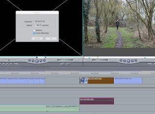
From the above I changed the tempo slower - from my improvements that I got from my peers they wanted me to change the speed of the antagonist character to a more slower creepy speedy and this links in really well with the tone of the music and shows a thriller aspect as well.
Sunday, 5 March 2017
feedback from peers on overall work so far
Person 1
Person 2
- Its good however the font for the names of the actors need changing
- Change the background and get a better image for the background
- Distort Josephs voice to make it an unknown voice
From getting feedback from other people I am going to take this on board and make a few tweaks to my work to help meet the needs of my peers, as this feedback is very important.
Poster
- "She is my girl" is too close to the title and the photo and it would look better if there is more space because it looks too squashed
- The text is too close to the top of the poster
- If I want to ratings think about repositioning the items on the page
Magazine
- Have a more exciting background
- Date, issue number and time are too big - magazines have them smaller
- The white text in the MacBook Air prize is not clear enough
- The colour blue looks out of place and maybe use it more in your magazine
Trailer
- Special effects are not in stereo and only come through in one headphone - camera click
- First bit of onscreen text is too early on ad should be later in the trailer
- go over everything and make sure that whenever you edit the scenes they cut to the beat of the song
- Go some editing so it looks more like a trailer - decrease saturation e.g. give it a film look
- Change the aspect ratio to make it look more like a film
- Make sure all the sound levels are equal
Person 2
Poster
- Its good however the font for the names of the actors need changing- Change the background and get a better image for the background
Magazine
- Change the font to link with the posterTrailer
- Colour correct the trailer to make it look more professional- Distort Josephs voice to make it an unknown voice
From getting feedback from other people I am going to take this on board and make a few tweaks to my work to help meet the needs of my peers, as this feedback is very important.
Friday, 3 March 2017
Planning for evaluation


1. In what ways does your media products use, develop or challenge forms and conventions of real media products?
Theories that I will use for this question, linking back to work and question:
- Steve Neale
- Reception theory
- Postmodernism
- Stereotypes
2. How effective is the combination of your product and ancillary texts?
Theories that I am going to use:
- Altman
- Steve Neale
- Todorov
- Miller's theory
3. What have you learnt from your audience feedback?
Theories that I am going to use:
- Propp theory
- Levi-Strauss = binary opposite
- Todorov = equilibrium
- John Berger 1972 = multiple viewing/consumption methods
4. How did you use media technologies in the construction and research, planning and evaluation stages?
use this website to help me with theories for technology question: http://randymatusky.com/2015/04/03/web-2-0-vs-web-3-0-what-really-is-the-difference/
Tuesday, 28 February 2017
Extra information on trailer
As I have been told narrative is important I am going to add this after bits of a clip to help make the audience understand exactly what the trailer is about.
Friday, 24 February 2017
Ending titles created for the end of my trailer
Above is what I am going to have as my ending titles which include the title of the film and that it is coming soon to cinemas. This is often what is done on conventional trailers so this is what I have done for mine.
Monday, 20 February 2017
Production Company logos created
From the above here is my production companies that I have created so far that will be shown in my overall trailer. The reason for this is that it shows all of the conventions of a trailer because I have noticed that a lot of them add in the production companies that helped to create the film.
Saturday, 18 February 2017
Ideas to help me with different titling for my trailer
Name of film titling ideas


By looking at the above images all of the titling links in really well with its genre and the narrative that is shown within the trailer, meaning that when I create my film titling for the trailer it needs to be relevant and show a clear indication of the type of narrative that is being expressed within the overall film. Otherwise it would be pointless to watch and the audience would get confused by what the titling is showing and would see it as unprofessional and won't go and see it at the cinemas.
End trailer titling

From the above titling this is used to show exactly when the film is coming out in the cinemas and often gives extra detail underneath that can include what there is to offer at the cinema in this case Real 3D and IMAX 3D suggesting that this film company spent a lot of money on producing, editing, filming and getting actors for this film and this is something that I need to think about when creating my final titling on my trailer.


From the two examples above I am thinking of merging this information about all the production companies involved, crew, actors and actresses at the bottom. However on mine I will be putting 'Coming Soon' and not add in a date as this allows to make the audience wait a bit longer and become more and more excited for when they officially find out the actual date it will be released.
Approved for audiences image at beginning of every trailer

Something like this above image is going to be at the beginning of my trailer as I have noticed a lot of trailers add this on, this allows the film companies involved with the production of the film to show the audience that it has been approved for their specific age group that it is targeted at and the film rating website have checked it over too, which backs up the information being given. This shows that the trailer is reliable and has been worked hard on for the intended target audience that it was created for, making it trustworthy for audience enjoyment.
Wednesday, 15 February 2017
Snowflake model of creativity - David Perkins
Above the writing in the colour purple is my own ideas and whether I think I am the creativity traits that I have stated on each slide.
Tuesday, 14 February 2017
Colour wheel

From looking at the colour wheel I have decided to use colours that link well with the burgundy red colour that I have used for my main image, also I feel as though I should use primary colours because this will help it all link together and not look too over the top on the magazine front cover. Also the colours I will be using is light blue black and burgundy as these aren't too vibrant and too overwhelming for the eye.
Sunday, 12 February 2017
picking out images for my magazine for the second time


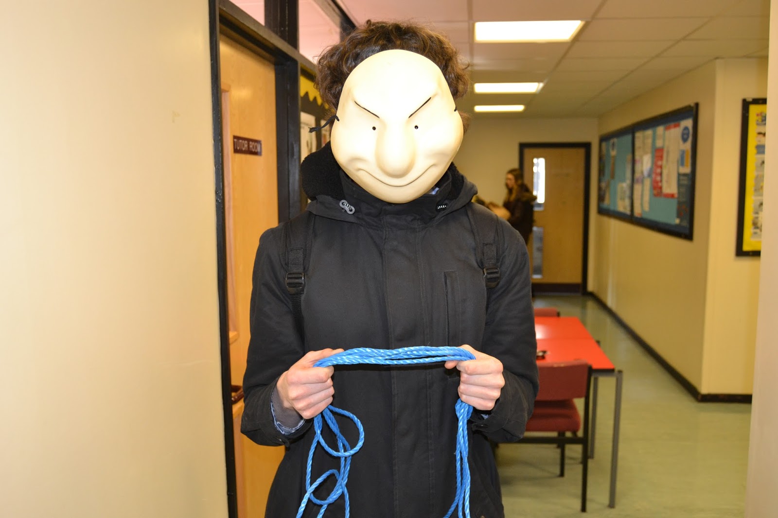

The last picture above from the overall 5 images is the image I have decided to use for my magazine cover and this allows me to easily edit out the background and use a threshold technique by making it red and black with a white background. Also I am going to make it stand out and have the Samantha text going underneath the rope and his hands to create a sinister effect, as well as this I am am going to create an illusion of both of the images overlapping each other. Here is what I have done so far with the effect that I have stated:

Also my poster has an obvious colour scheme that all links together and I have at least 3 fonts used too a lot like any other conventional magazines, however the image used is unconventional as it isn't a standard image like other conventional magazines and because it looks more like a drawing it is unique as well as many magazines don't do this type of effect. In addition, I have used blue lines in photoshop to help me keep everything in proportion.
Looking at other Blogs to help me with my own - stylistic influences Matt Lovett
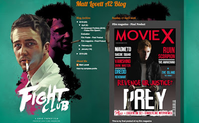
From looking at Matt lovett's work I have decided to portray something in comparison to it but not exactly copy the entire magazine as I have done different effect compared to him an a completely different colour scheme and trailer. But I feel his work is very helpful in portraying what a good magazine looks like with appropriate text sizes and fonts to help it all link together and become a more professional looking ancillary product.
Friday, 10 February 2017
Draft magazine cover - that I won't be using

From the above image I have decided that it isn't good enough for my magazine cover as all of the colours don't link together and because I have added random images I feel that they aren't really as relevant to the genre I am going for, so I have decided to change my idea and go for a close up of the antagonist character instead.
Thursday, 9 February 2017
Peer assessment from teacher

From the above self assessment I have found out from discussing how far I have come with my coursework the improvements that need to be made are making the trailer a bit more creative, however from previous experience if I did something more creative then I won't be able to get the important characters accurately in focus and that is why I have maybe gone for more simpler shots this year. As well as this another Improvement is to add fades and quick flashes to help the whole trailer run smoothly, while at the same time integrating production companies and reviews within the trailer. Finally for my film poster it is really high quality and nearly finished, however I need to now focus more on my magazine and use a different image within it because it doesn't look as professional at the moment. Instead I will add the main antagonist characters face as the front magazine cover to then make it feel and look more like a magazine and creates enigmas towards what might be written in the magazine if created.
Tuesday, 7 February 2017
Draft magazine drawn by hand

From the above image I have drawn a draft magazine cover where I will have a close up of the man with the mask and I have decided to name my magazine 'capture' as it links to filming and capturing different images or footage. Also this is just a draft that I have drawn, so the writing around the image might change to make it look and sound more professional on my final magazine cover.
Sunday, 5 February 2017
How to create animation on Photoshop CS5 and Flash
Create an animated GIF in Flash and Photoshop CS5
Photoshop CS5:
- Get files in order, I need to use different created images that are a JPG format to be able to compose separate frames for a GIF and have them all in a folder together to make it easier to edit
- Open window animation and then it comes up with a timeline
- Make layers into animation frame
- Add the duration of the frame where you can change how long each frame is on for when shown as a GIF/animation
- SAVE work and add onto Final Cut Express
Flash:
- Get all files that will be used together
- Create the animation, decide how long the animation should be and make sure the background layer is visible for the entire animation by selecting it then right clicking on the 120 mark in the timeline and selecting "insert frame" from the drop down menu
- Test and edit animation
- export as GIF image or animation
From the above website I have discovered that I can use either of the two software available to create animation and I will try both to see which one I prefer.
Saturday, 4 February 2017
research and planning mark scheme

From the above research and planning mark scheme I have already got:
- planning and research in detail and evident on my blog
- Research on similar products and a potential target audience is evident on my blog
- I have created shot lists for each specific day of filming, layout of my ancillary poster but need to have a layout for my magazine, scripting and storyboarding is up to date
- I have excellent organisation of actors, locations, costumes and props that are used throughout the filming
- I definitely to have excellent time management
- Used digital technology and ICT in some presentations, might need to use even more
- I have used communication skills
- I have made sure that there is care when presenting my research and planning as well
Thursday, 2 February 2017

Looking at Mad To Be Normal trailer
From looking at this trailer I have discovered that it starts off with setting the scene and meeting all the characters involved in the film and then something chaotic happens but these are quick flashes so it doesn't give too much away. Also from the theorist Todorov this trailer shows evidence of a state of equilibrium at the outset, a disruption and then quick flashes of trying to repair but not exactly giving everything away so the audience don't then know everything that happens as this would be boring. In addition, this is something that I need to keep in mind for my trailer because I need to keep it exciting and interesting and not make it like a short film.
Monday, 30 January 2017
Looking back at action plan
Above is the work that I have finished on my blog so far, just need to do two more important pieces of work and then anything extra to show my progress of my ancillary products and my trailer.
Friday, 27 January 2017
Thursday, 26 January 2017
Monday, 23 January 2017
organising footage for woods scenes

From the above I have organised the footage for the trailer that I am going to use for green, might use for orange and not going to use in red.
Friday, 20 January 2017
Using threshold on film poster - audience feedback
from using this tutorial I changed the image to a black and white effect as from my audience feedback they said that it would look better like this with the antagonist character in the background

More people preferred the black and white version but asked me to use a different effect to help make it see the important parts of the picture and that is why I used the threshold effect on photoshop, feedback is a follows:
- Jodie and Mrs Fisher - Samantha text needs an effect e.g. glow behind it to make the text stand out, film reviews need to be around the image to make it look more like a poster, actors name needs to be in a different font because at the moment it doesn't look professional enough
- Sam - have a change in threshold by making Sarah black and white then Joseph
Below is evidence of taking the audience feedback on board so far, its not finished yet because need to change the title effects and the actors font:

Thursday, 19 January 2017
Shooting schedule #2

From the above information I have organised specific scenes for the woods, where I will be using this as reference for each important part in the trailer to help me keep everything organised on the filming day and not forget where I was when filming because I would have ticked this sheet off when finished.
Organising actress #2

From the above message is it is evident that I have organised when and at what time we are doing the filming and where exactly the filming is going to take place at. Also I made sure that the actress brought along earphones as this is key within the section of the trailer, allowing me to make sure that mise-en-scene is accurate and well planned out. As it is important to have all of the necessary props and clothing warn by the actors/actresses to show different personality traits and suggests whether this person is inside or outside.
writing out credit block - basic

From the above source, I used a template like this to get the credit effect when it comes to creating a poster so then it can stand out a lot more and look like a real film is being produced. Also if I didn't have this at the bottom the audience would see the film trailer as not being official and will then not go and see it.
Editing the poster using different effects

Above I used the exact same colour from the cross in the my girl text, this then allows the whole poster to be colour coordinated with red and black. Also by having the cross effect at the bottom can help the audience create ideas towards why this may be important because it does link really well with what happens in the trailer and what might even happen in the film, if it was created.

Above I have contrasted with the brightness to overlap the image to show both together by lightening the brightness to create a double exposure effect with both images, which was my aim from the start.

I wanted to change the effect of the cross to help make it stand out with a plastic effect to make it look a lot like blood, which links in well with the antagonist character who murders many people because of his mental health.
Wednesday, 18 January 2017
Weather Forecast for filming

I am wanting to film the scenes that are in the woods on Saturday in the morning with Sarah, as it is not going to rain and is the type of atmosphere I need to help the trailer look more like a Horror/Thriller genre. Also because I am working I can't do any filming for gone 4pm and it will be dark then as well so need to get filming in day time done as quickly as possible.
Tuesday, 17 January 2017
organising images for poster and magazine


Audacity - editing sound
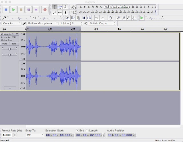
From the above audio I have changed the tempo to help hide the identity of the antagonist character, so far I have changed:
- change tempo = 20.001 - length 3.20 + 2.67
- speed 1.061, percent change = 6.072
- pitch = 1.000
- amplify - amplification = 2.91
- click removal - 244 = threshold, max spike width = 10
- echo = delay time 4, decay factor = 0.7
- leveller, degree of levelling = light, noise threshold = -20db
- phaser stages = 10, dry/wet = 63, LFO frequency (Hz) = 1.2, LFO start phase = 40, depth = 76, feedback = -10
- normalise = -2.0
photoshop edits
Brightness /contrast
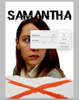
Above I have done some editing where I have changed the brightness and contrast of the image, this helps to create an ominous atmosphere for when the audience look at the poster and wonder what Samantha might be looking at. Also i have changed the colour of the paper that has been ripped to make it blend in a bit more with the background.
Exposure

Above I have also changed the exposure to help the audience to quickly identify the genre as being a horror/thriller which connotes to the colour scheme used. In this case it seems to be darker than the picture that was taken, as seen below:

Idea taken from a film poster

From the image above I have used the idea of ripped paper below the picture of Tom hank as it links in really well with my trailer, also the audience can create an enigma code towards what might actually happen in the film. This is very useful when it comes to either creating a poster or magazine as it helps the audience interact more with the adverts that have been publicised, this then helps to persuade audiences to go and see the film.
Thursday, 12 January 2017
Peer assessment
From the above word document I need to make sure that I start comparing exam board example, audit mark scheme and cross reference with my blog, provide R&P which evidences depth and discuss how audience feedback shapes my project. By getting this feedback I will make sure that I meet all of the improvements to help show skills and changes with evidence from what my intended audience think about my work and show how I am improving with other exam board examples and auditing mark scheme will help me greatly.
Wednesday, 11 January 2017
Samantha pictures for poster - Ancillary product


From the above images I have made sure that the background is easier to edit out for my ancillary product, which is the poster. I have changed the background from green to grey because I have discovered that the outline of the green is still seen around the actor (picture 1) and the decision to change the image have made made it easier to use the quick selection tool around this person and then delete the background to get smooth edges that don't look too green around the edges of the picture and then overall look professional and gets the audience to want to discover more.
The Victims


By taking these pictures behind an object helps to create the feeling that the character has been following these people, also these pictures help the antagonist character to remember exactly what they look like for when he may find the right opportunity to get them. However, this won't be seen in the trailer as it only gives sneak peaks of what might happen without giving too much away. In addition, these aren't the main characters in the trailer and the character Samantha is the victim who will be focused on the most.
There are many audience theories that help to create meaning and representations the first one is the effects model, this suggests that the consumption of media texts has an effect or influence on the audience and the power also lies within the message itself. As well as this, the images will create the feel of someone stalking people. Evidence for this is shown from this evil villain hiding behind anonymous objects, which helps create connotations by consuming what is seen in the image when shown on the trailer by my intended audience or a wider age group. This is incredibly noticeable by the way the pictures have been taken. Also another theorist that can represent these images is Stuart Hall (1970), when the producer (which is me) constructs a text or in this case a film trailer it is then encoded with a meaning or message that the producer wishes to convey, this is exactly what my idea was trying to put across by helping the audience to understand that these pictures have been taken without any suspicion or notice from the victims who are getting on with there day-to-day lives.

The person in the picture above is the main character Samantha, but this time the image won't have any crosses through it and will just have a circle around her head to show that it is his next victim. Also throughout the trailer the audience will notice that she is the main character as we will see her a lot throughout snippets of scenes that would have been taken from the film.
Tuesday, 10 January 2017
consent form


As seen above I have made sure that I have got consent from the people who are going to be in the film trailer, on my poster and magazine. But needed to make sure that they were happy with what I wanted them to do before starting all of the photography and filming process. The reason for this is that it is always helpful to get consent first instead of getting someone involved who doesn't exactly want to do it.
Subscribe to:
Posts (Atom)