


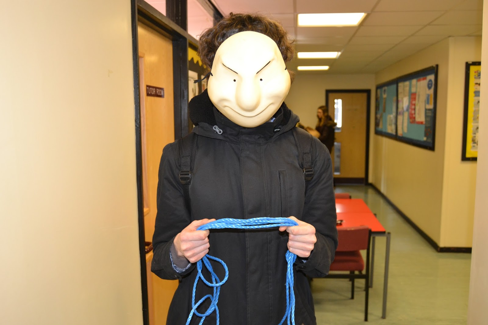

The last picture above from the overall 5 images is the image I have decided to use for my magazine cover and this allows me to easily edit out the background and use a threshold technique by making it red and black with a white background. Also I am going to make it stand out and have the Samantha text going underneath the rope and his hands to create a sinister effect, as well as this I am am going to create an illusion of both of the images overlapping each other. Here is what I have done so far with the effect that I have stated:

Also my poster has an obvious colour scheme that all links together and I have at least 3 fonts used too a lot like any other conventional magazines, however the image used is unconventional as it isn't a standard image like other conventional magazines and because it looks more like a drawing it is unique as well as many magazines don't do this type of effect. In addition, I have used blue lines in photoshop to help me keep everything in proportion.
Looking at other Blogs to help me with my own - stylistic influences Matt Lovett
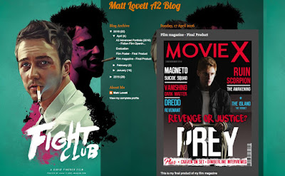
From looking at Matt lovett's work I have decided to portray something in comparison to it but not exactly copy the entire magazine as I have done different effect compared to him an a completely different colour scheme and trailer. But I feel his work is very helpful in portraying what a good magazine looks like with appropriate text sizes and fonts to help it all link together and become a more professional looking ancillary product.
No comments:
Post a Comment