From the above shows I have got all work up to date and finished and by having this resource to keep looking at it allows me to keep looking at different things that I need to get done or finish.
Friday, 24 March 2017
Sunday, 19 March 2017
Wednesday, 15 March 2017
Finished film poster

From the above film poster I have gone for a simple approach that helps the audience to create an enigma code towards what might happen in the film and sneaky I have added the antagonist character in the corner to help with the idea that Samantha is scared of this person, but why I hear you cry? To create a sense of fear and make the audience to come up with their own narrative as well.
Finished Film Magazine

Above is my finished magazine cover and I have made sure there is a clear colour scheme and I have gone for an unconventional approach with the picture, as this uses a threshold technique and makes my magazine stand out from every other film magazine cover that is out there and it entices
my intended audience to go and buy it at the shops.
Thursday, 9 March 2017
changing the tempo of the antagonist character
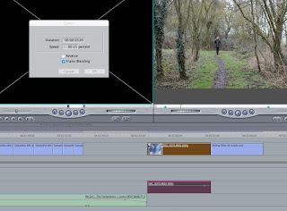
From the above I changed the tempo slower - from my improvements that I got from my peers they wanted me to change the speed of the antagonist character to a more slower creepy speedy and this links in really well with the tone of the music and shows a thriller aspect as well.
Sunday, 5 March 2017
feedback from peers on overall work so far
Person 1
Person 2
- Its good however the font for the names of the actors need changing
- Change the background and get a better image for the background
- Distort Josephs voice to make it an unknown voice
From getting feedback from other people I am going to take this on board and make a few tweaks to my work to help meet the needs of my peers, as this feedback is very important.
Poster
- "She is my girl" is too close to the title and the photo and it would look better if there is more space because it looks too squashed
- The text is too close to the top of the poster
- If I want to ratings think about repositioning the items on the page
Magazine
- Have a more exciting background
- Date, issue number and time are too big - magazines have them smaller
- The white text in the MacBook Air prize is not clear enough
- The colour blue looks out of place and maybe use it more in your magazine
Trailer
- Special effects are not in stereo and only come through in one headphone - camera click
- First bit of onscreen text is too early on ad should be later in the trailer
- go over everything and make sure that whenever you edit the scenes they cut to the beat of the song
- Go some editing so it looks more like a trailer - decrease saturation e.g. give it a film look
- Change the aspect ratio to make it look more like a film
- Make sure all the sound levels are equal
Person 2
Poster
- Its good however the font for the names of the actors need changing- Change the background and get a better image for the background
Magazine
- Change the font to link with the posterTrailer
- Colour correct the trailer to make it look more professional- Distort Josephs voice to make it an unknown voice
From getting feedback from other people I am going to take this on board and make a few tweaks to my work to help meet the needs of my peers, as this feedback is very important.
Friday, 3 March 2017
Planning for evaluation


1. In what ways does your media products use, develop or challenge forms and conventions of real media products?
Theories that I will use for this question, linking back to work and question:
- Steve Neale
- Reception theory
- Postmodernism
- Stereotypes
2. How effective is the combination of your product and ancillary texts?
Theories that I am going to use:
- Altman
- Steve Neale
- Todorov
- Miller's theory
3. What have you learnt from your audience feedback?
Theories that I am going to use:
- Propp theory
- Levi-Strauss = binary opposite
- Todorov = equilibrium
- John Berger 1972 = multiple viewing/consumption methods
4. How did you use media technologies in the construction and research, planning and evaluation stages?
use this website to help me with theories for technology question: http://randymatusky.com/2015/04/03/web-2-0-vs-web-3-0-what-really-is-the-difference/
Subscribe to:
Comments (Atom)